SoftServe Academy
Rebranding

- Color
- Visual system
- Templates
- Guidelines
A rainbow of inconsistent visuals, unified into one recognizable system — across 40+ AI-generated course visuals.
See more↓By 2024 the Academy had scale and reputation, but its visual communication hadn't kept up.
SoftServe Academy is the educational arm of SoftServe — an ecosystem that has been creating and developing IT talent since 2005. It trains everyone from first-steps students to career switchers to experts in emerging fields like AI, Robotics, and Cybersecurity.
My work was to give it one coherent visual identity — a system recognizable enough to match the authority the Academy had already earned.
A rainbow, not a brand
Until 2024, the Academy's visuals were a patchwork. Different areas and courses looked like separate projects rather than one school: many gradients, several illustration styles, inconsistent formats, and random imagery that said nothing about the technology it sold.
The cost was real: the Academy was losing recognition to competitors, had no unified visual logic across courses and daily communications, and no single element that said at a glance — this is SoftServe Academy.





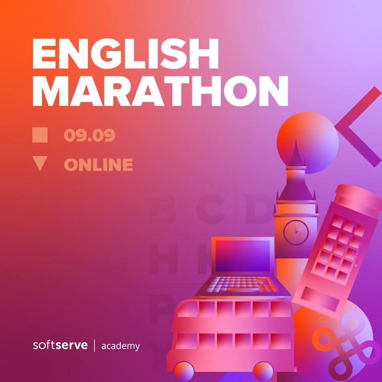
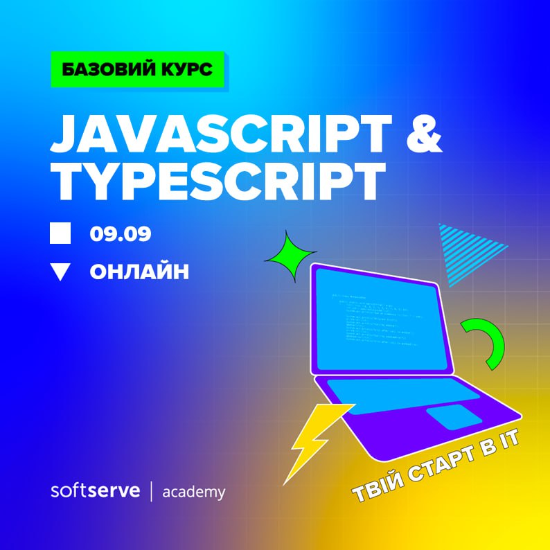
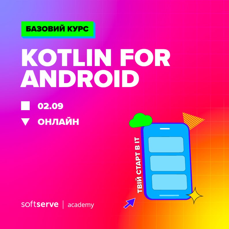


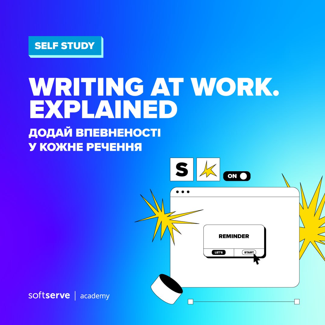

How do you turn a rainbow of inconsistent visuals into one recognizable system — one that reads as a near-two-decade authority, not just another course-seller?
The IT-education market is crowded with schools that all look loud and interchangeable. The task wasn't to add more color or energy. It was to impose discipline — a system coherent enough that the Academy's experience showed in how it looked.
I worked as Brand & Visual Designer on the rebrand.
strengths and weaknesses.
Discipline, not more color.
I audited the category to understand how IT-education brands look — what reads as credible, what reads as noise. The analysis surfaced an opening: the combination of green and purple was largely unclaimed in the space.
We committed to it as the Academy's signature palette, with defined proportions so it would stay consistent across hundreds of touchpoints, anchored by black and white, with a full greyscale range for support.
The palette is deliberately strict — these four colors, their shades, and nothing else. The limitation is the point.
The validation came after launch: competitors began copying the same palette. When the category starts imitating you, the color decision was right.
Every technology is a machine
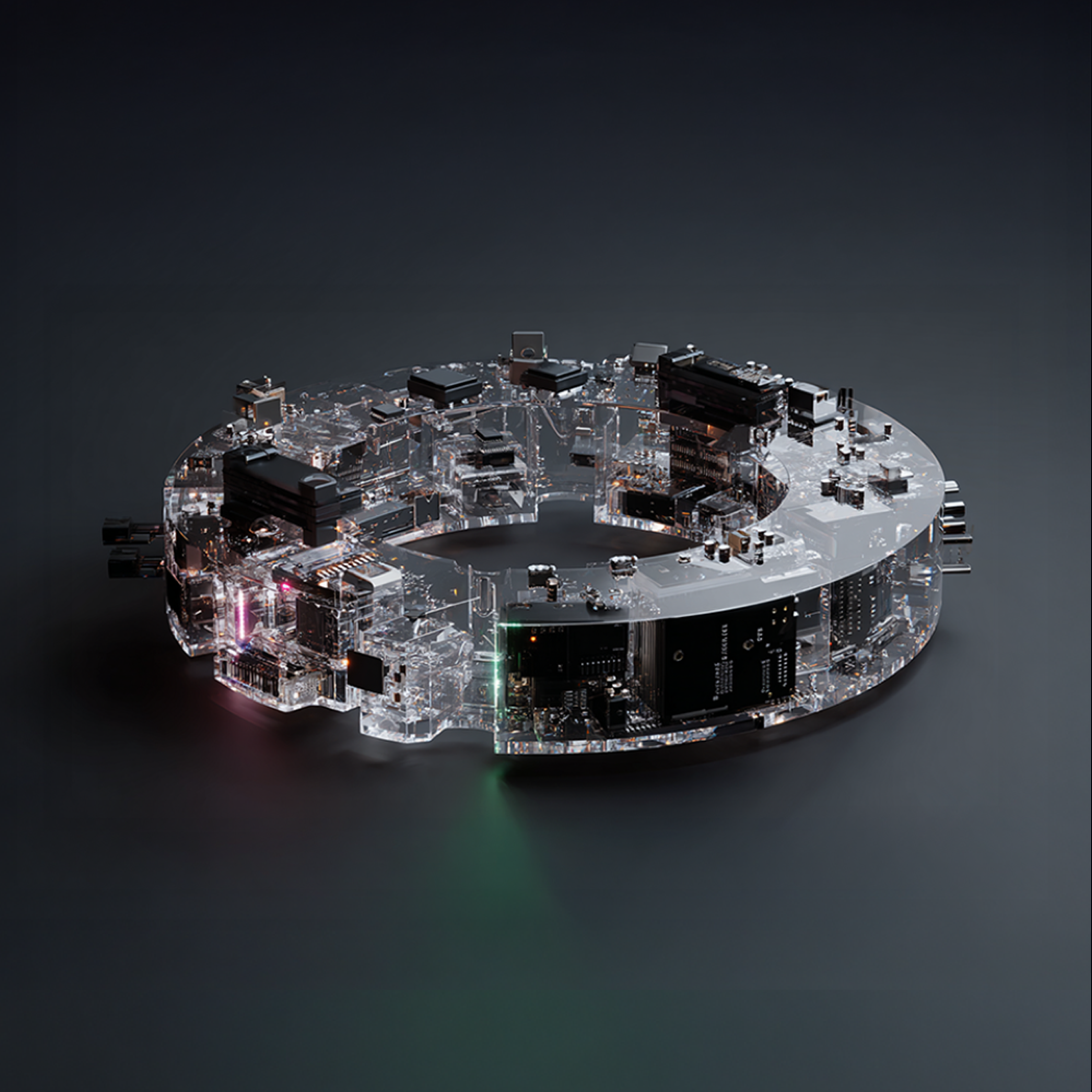
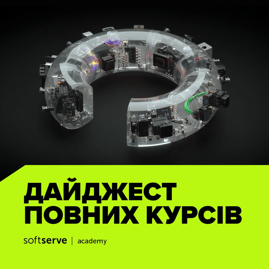
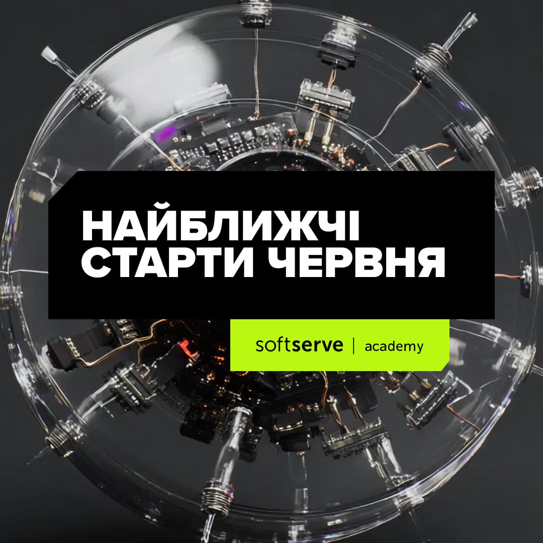
Instead of stock photos or random illustration, I built a rule: every programming language or technology is its own machine — a mechanism that metaphorically conveys its logic and character.
The payoff is a system, not a set of pretty pictures. Across 40+ unique course visuals, QA, Test Automation, Java, .NET, DevOps — every direction is instantly distinguishable, consistent, and tied to the actual technology, never arbitrary. One visual principle scales across the entire lineup.

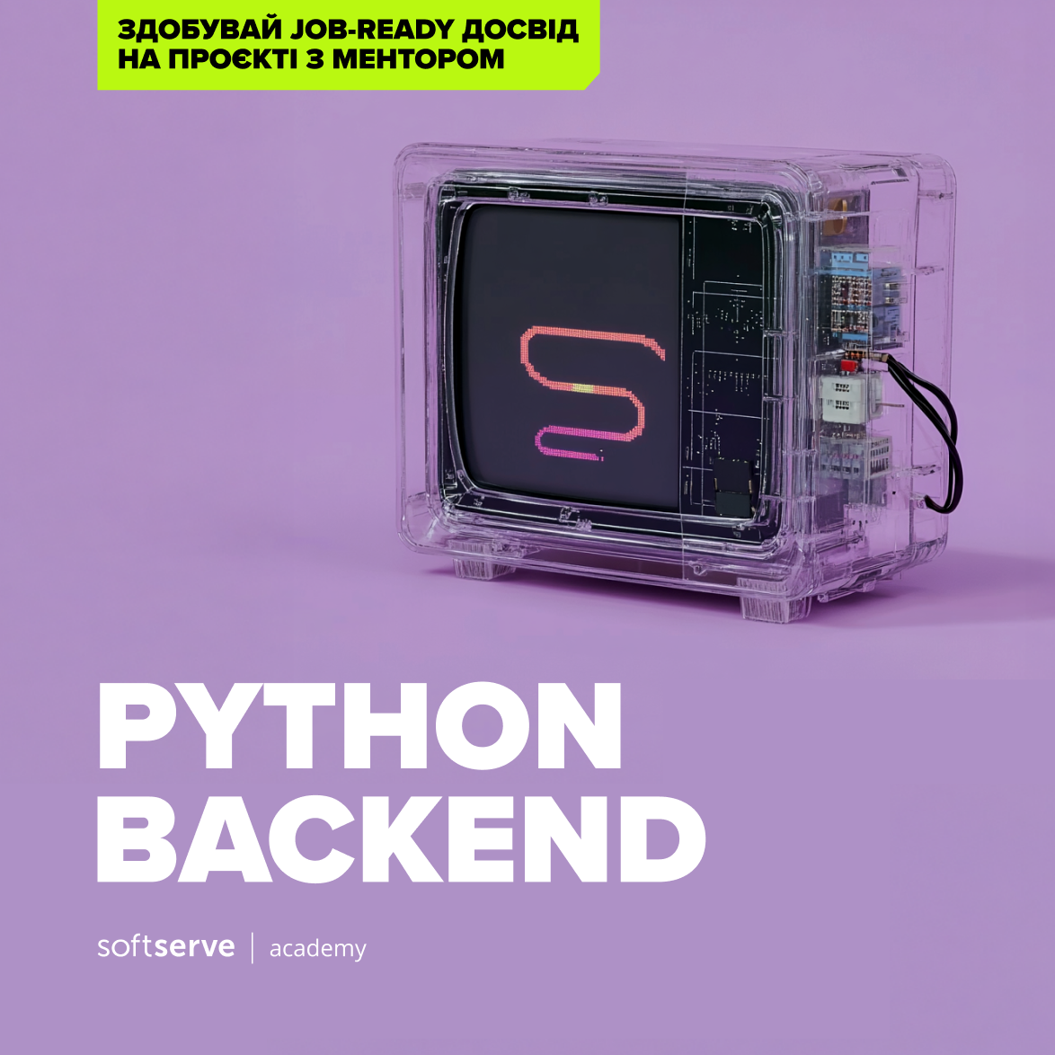
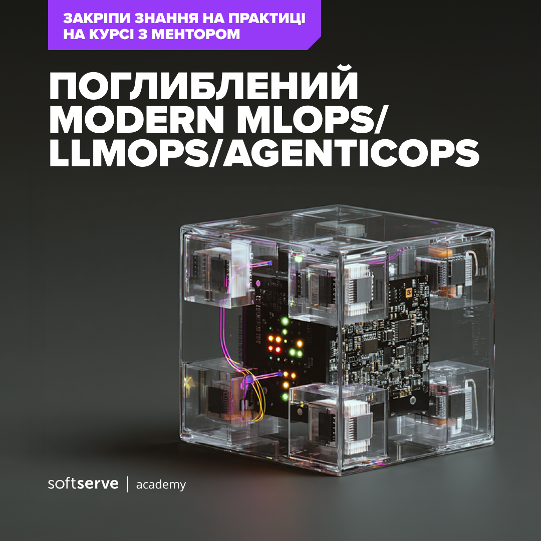
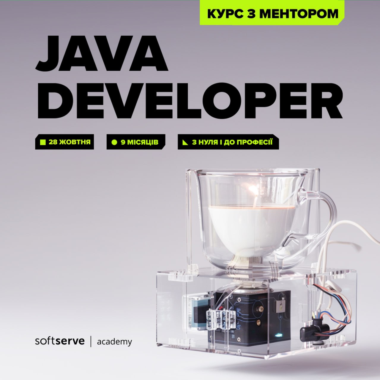
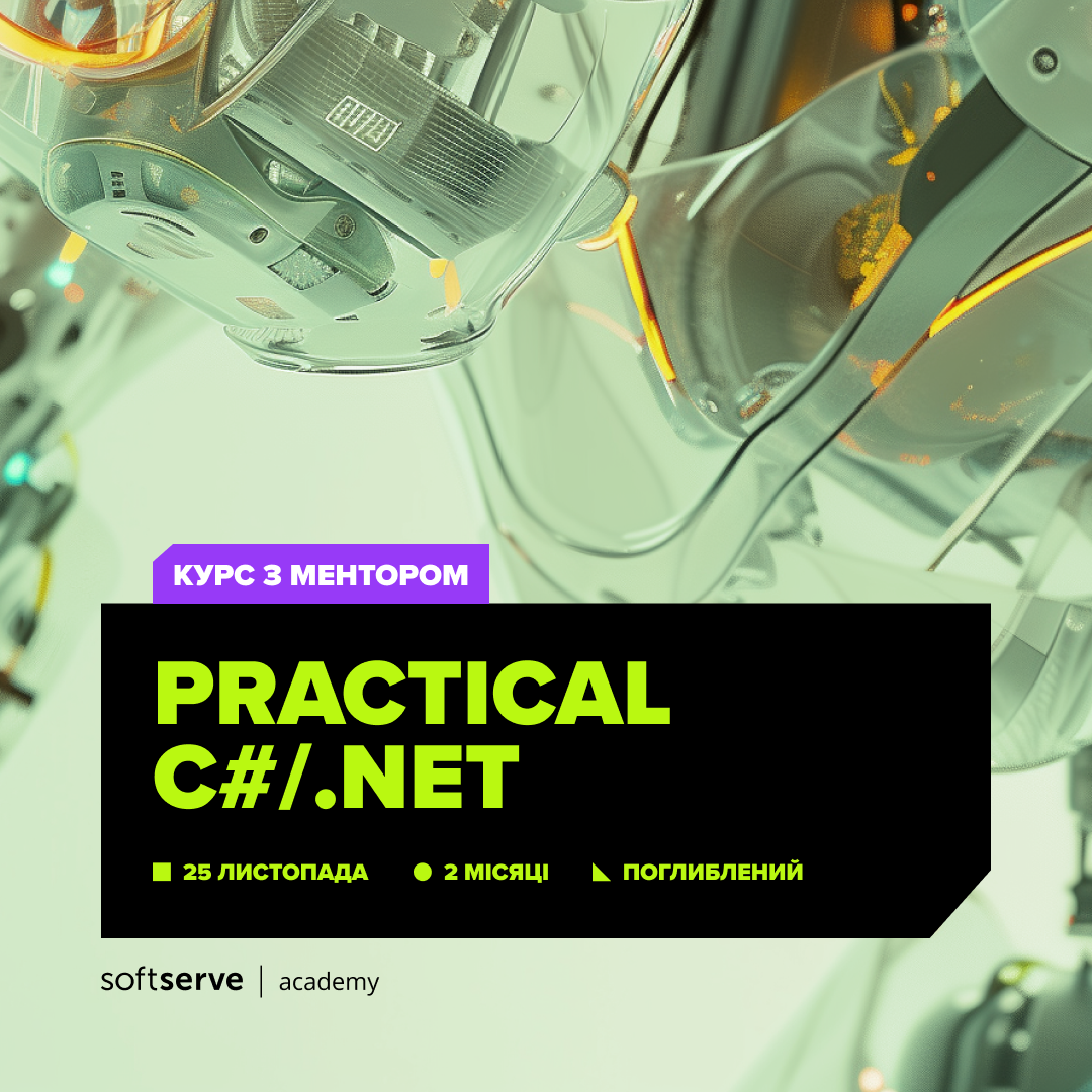

What holds it together:
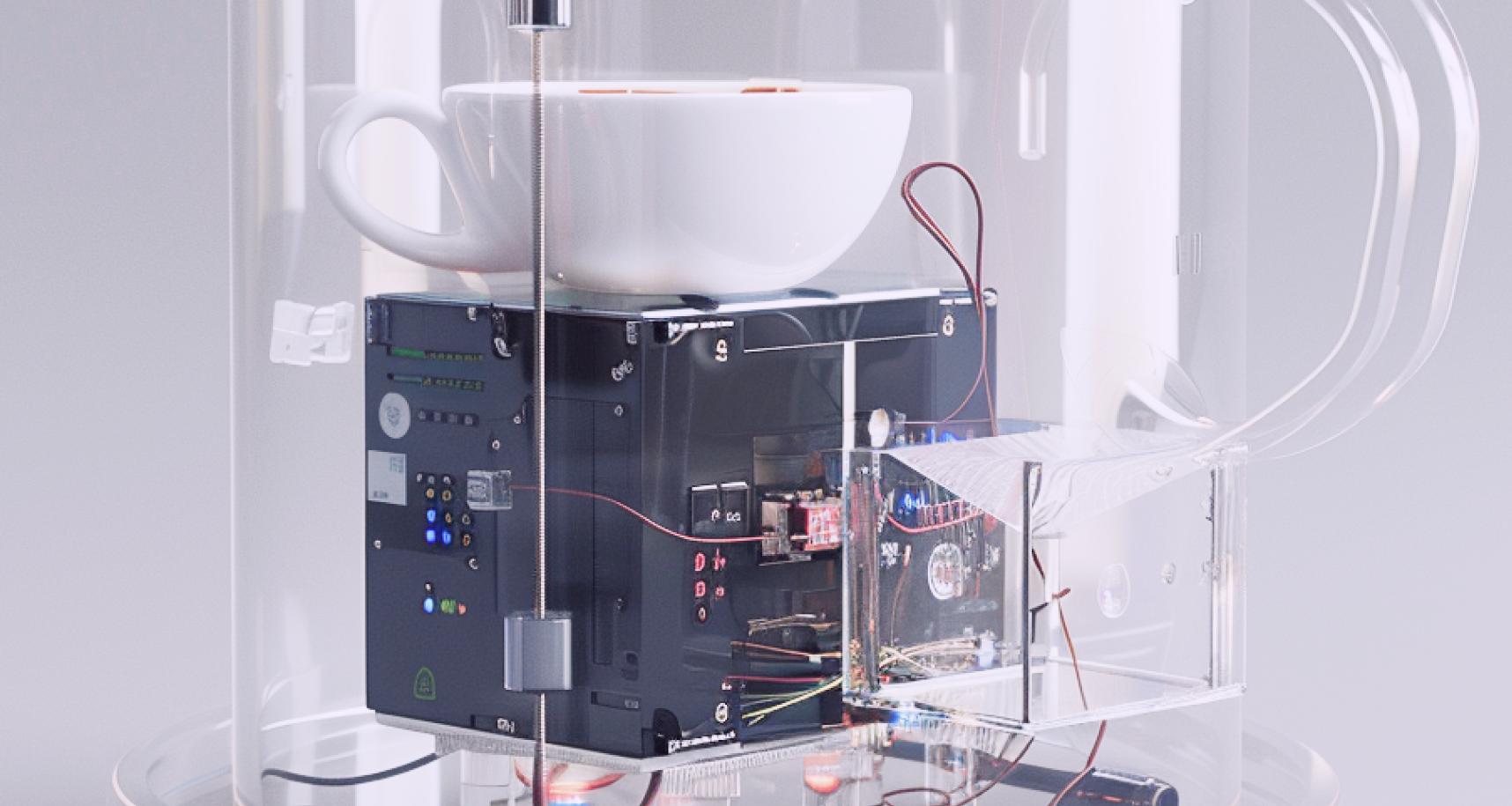
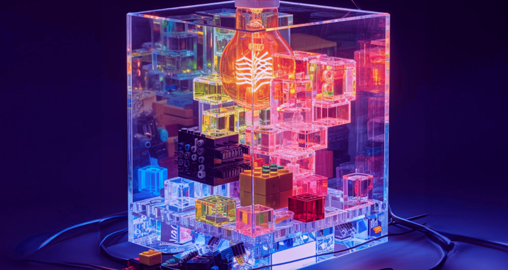



Together, these are the "strong unifying element" the brand had been missing: the thing that says, at a glance, this is SoftServe Academy.
The identity isn't just course covers.
The course lineup is organized as a matrix — areas (QA, Java, Test Automation, DevOps…) × learning levels (Basic, Advanced, Project-based, Full Course, Upskill, Expert, Internship) — so the whole ecosystem navigates logically and looks like one brand.
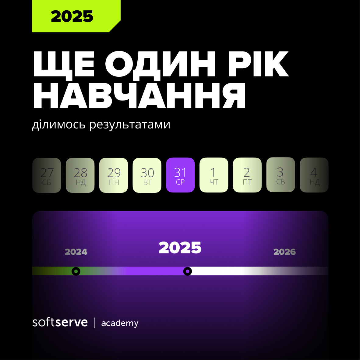
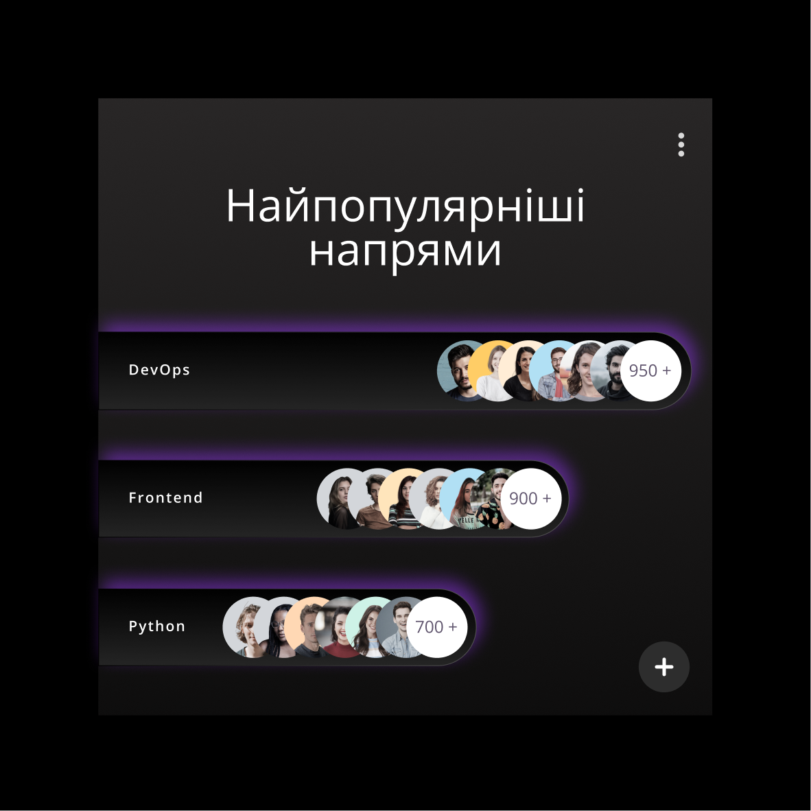
On top of that sits a full set of templates: daily communications, events, and merch — the same system applied everywhere, so the SoftServe Academy is recognizable far beyond a single post.

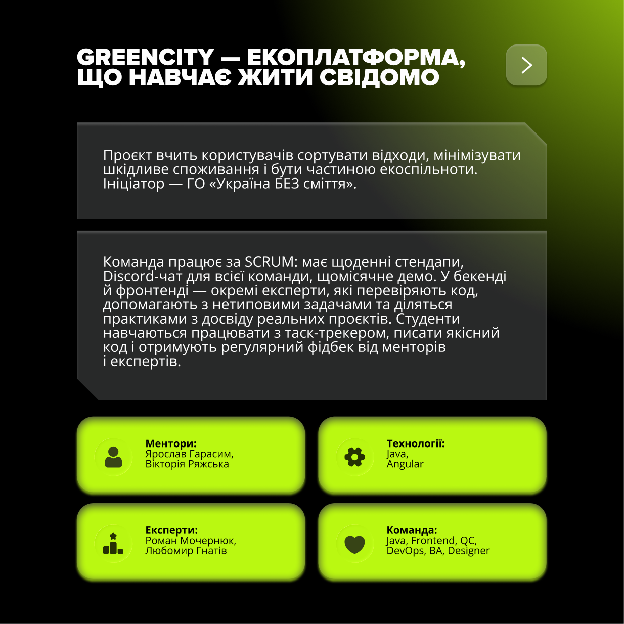
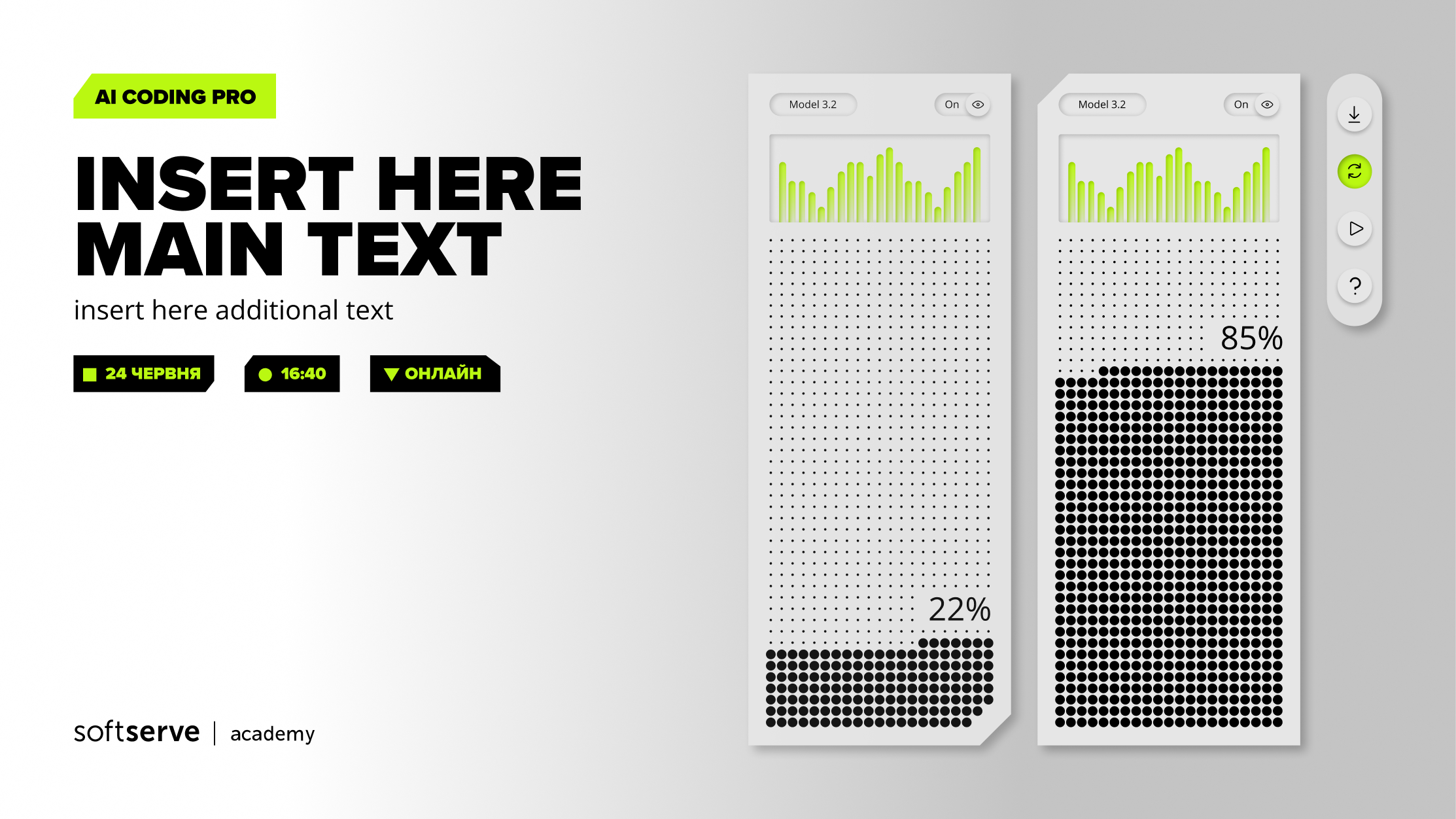
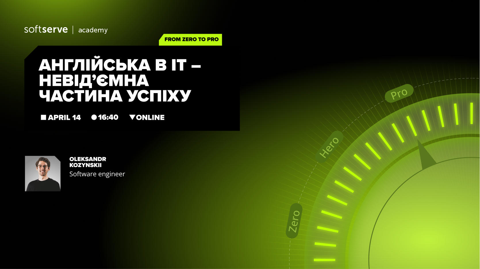
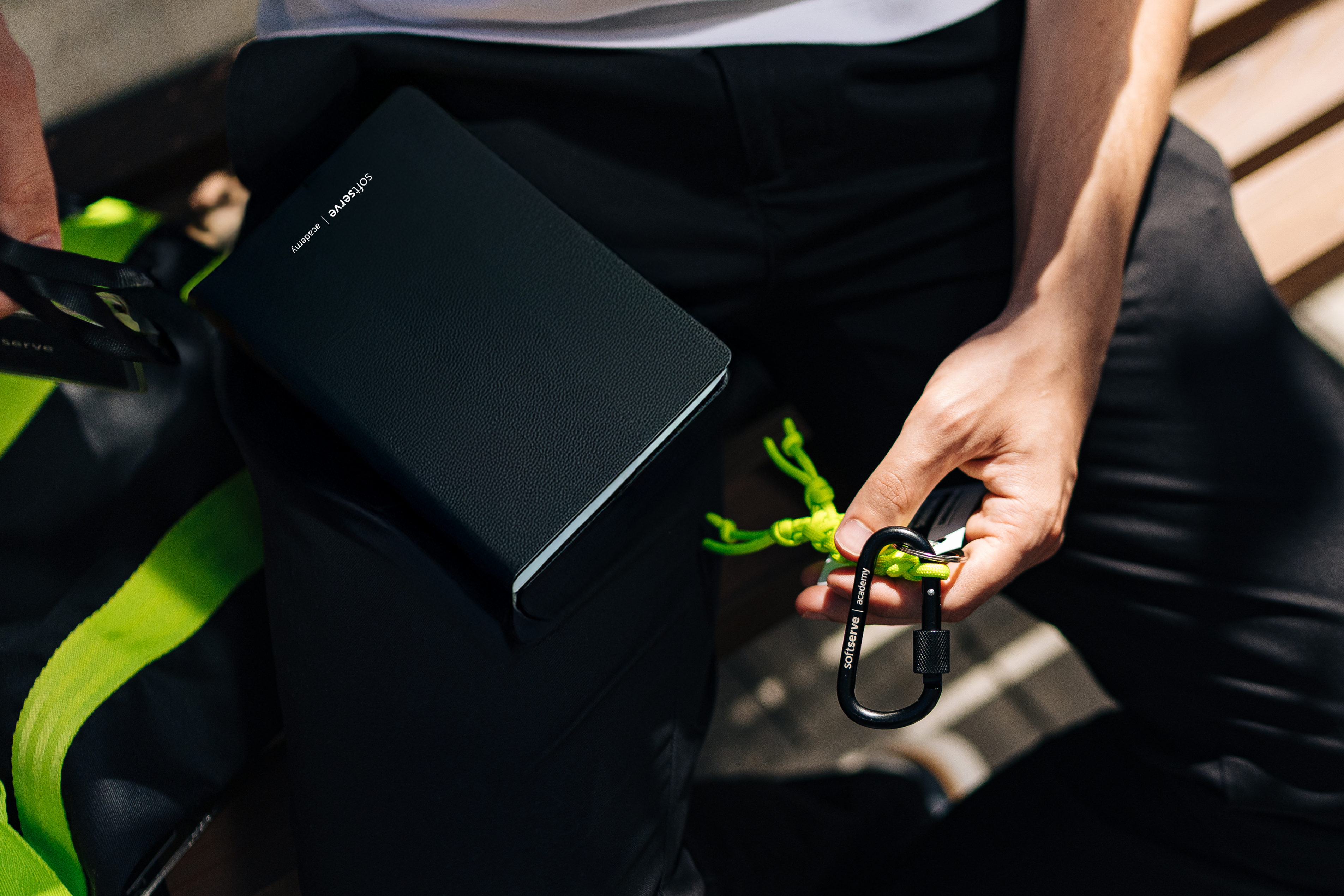
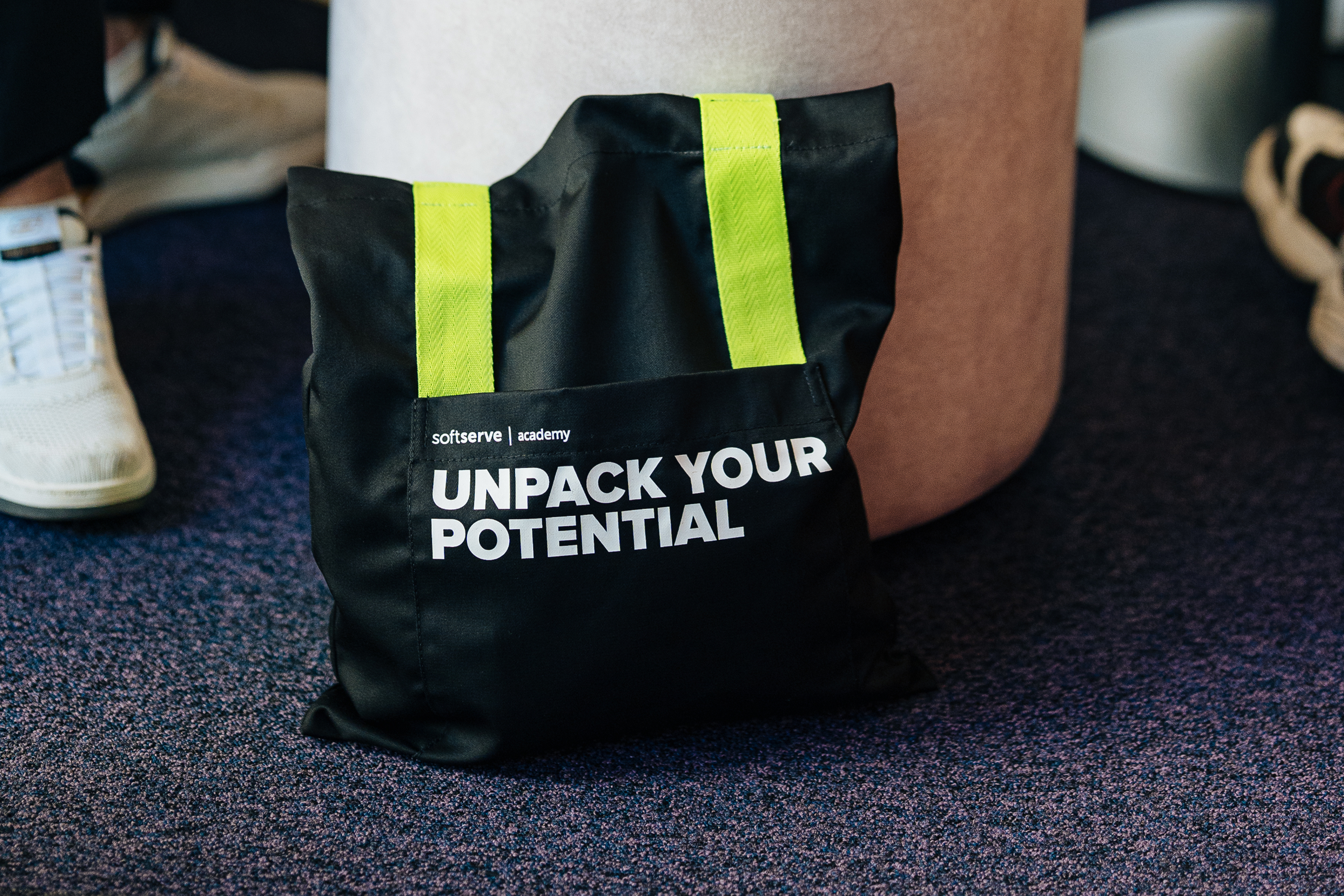

Beyond the look, the Academy stands for more than courses: learning that opens doors.
It's practical, mentor-led, and connected to real industry — the kind of place where finishing a course is a beginning, not an end.
The visual system had to carry that weight: look like somewhere serious enough to build a future, not just somewhere to buy a course.

After launch, two things proved the system worked.
Competitors started copying the palette
The green-and-purple space the Academy claimed became the one others chased.
“Is this a photo?”
The AI visuals were mistaken for photography. Viewers asked whether the backgrounds were photos — and were genuinely surprised to learn they were AI-generated. The system read as crafted and real, not synthetic.
One brand, one recognizable system — unmistakable at a glance.
SoftServe Academy didn't need to look louder. It needed one system disciplined enough to match two decades of experience — and distinctive enough that the category started following it.
One system, built to be unmistakable.